【背景渐变】 —— 就算没接触过也能 一遍学会哦
前期回顾
 回顾 前期
回顾 前期 
把你喜欢css动画嵌入到浏览器中 —— css动画 项目_0.活在风浪里的博客-CSDN博客常用酷炫动画999+合集,代码直接复制可用,总用你想找的,快来抱走吧,三连,停!听鹅说,下次一定、下次一定……https://blog.csdn.net/m0_57904695/article/details/127846345?spm=1001.2014.3001.5501 https://blog.csdn.net/m0_57904695/article/details/127846345?spm=1001.2014.3001.5501
听鹅说,别急!这个不难很简单,一遍过,一遍懂,我也算是复习下,直接开始,无废话版
目录
线性渐变默认上到下
如果加浏览器前缀不能加 to
颜色后可以设置大小比例
方位可以是度数
重复渐变
重复多层渐变
径向渐变(由其中心定义)
默认(椭圆 内向外)
圆形
设置径向渐变的中心点
多背景图片
结语:
线性渐变默认上到下
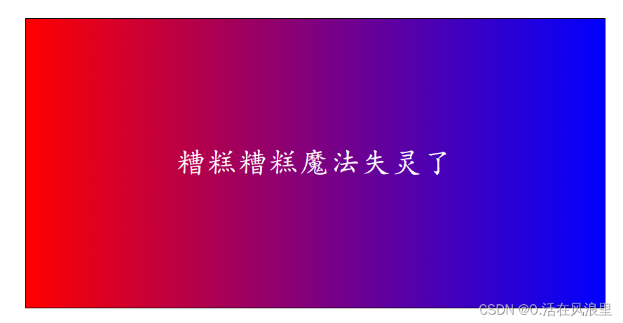
to 控制方向 从左到右 红到蓝
background-image: linear-gradient(to left, red,blue);
如果加浏览器前缀不能加 to
background-image: -webkit-linear-gradient(left, red,blue);
颜色后可以设置大小比例
/* 与单个方位值不同 可以理解为 到右下 *//* 技巧:方位对应最后的值 ==》 右下是蓝 *//* 颜色后可以跟大小比例 ==》 从开始到10%是红色,从10%到最后是蓝色*/background-image: linear-gradient(to right bottom, red 10%, blue 10%);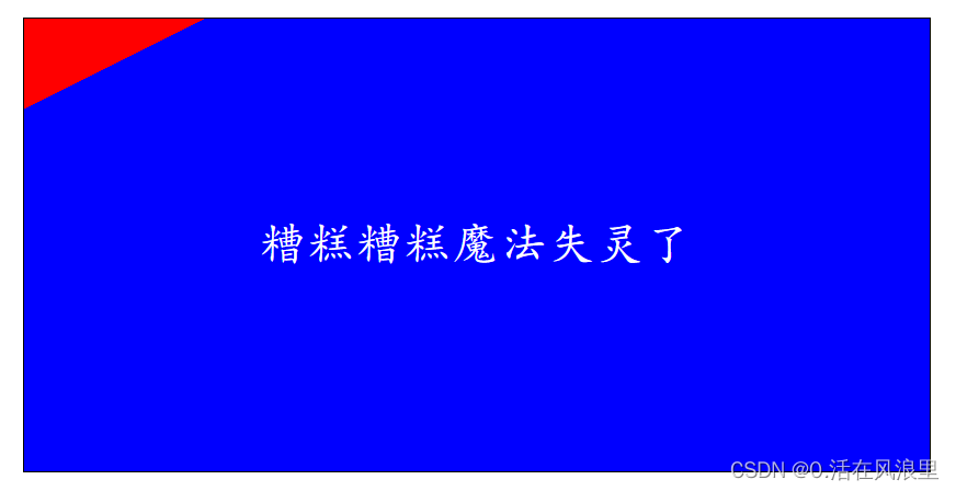
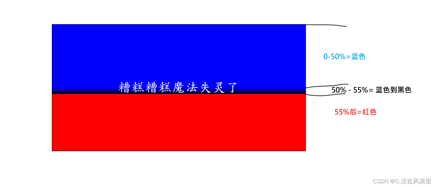
background-image: linear-gradient(blue 50%, blue 50%, black 55%, red 55%);
/* 根据头方位对尾值得出左上对应粉色 0-33.33%=蓝色,33.33%-66.66%=绿色,66.66%后=粉色 */background-image: linear-gradient(to left top, blue 33.33%, green 33.33%, green 66.66%, pink 66.66%);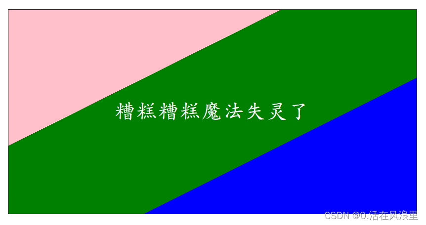
/* 根据头方位对尾值得出左上对应粉色 0-33.33%=蓝色,33.33%-66.66%=蓝色渐变为绿色,66.66%后=粉色 */
background-image: linear-gradient(to left top, blue 33.33%, blue 33.33%, green 66.66%, pink 66.66%);
方位可以是度数
background-image: linear-gradient(45deg,blue 33.33% ,green 33.33%,green 66.66%,pink 66.66%);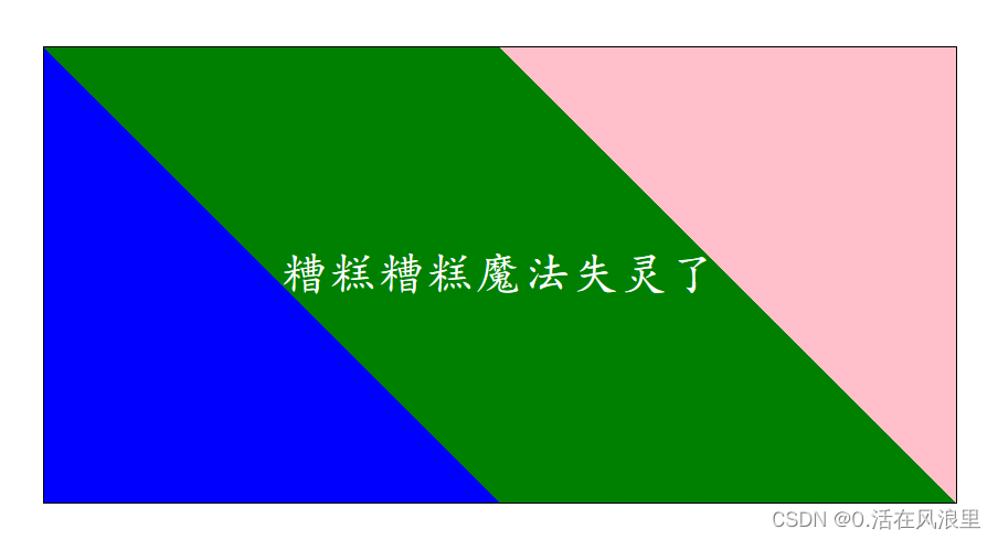

重复渐变
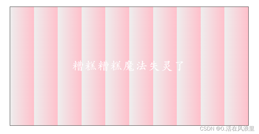
background-image: repeating-linear-gradient(to right, blue 10% , red 20% );
重复多层渐变
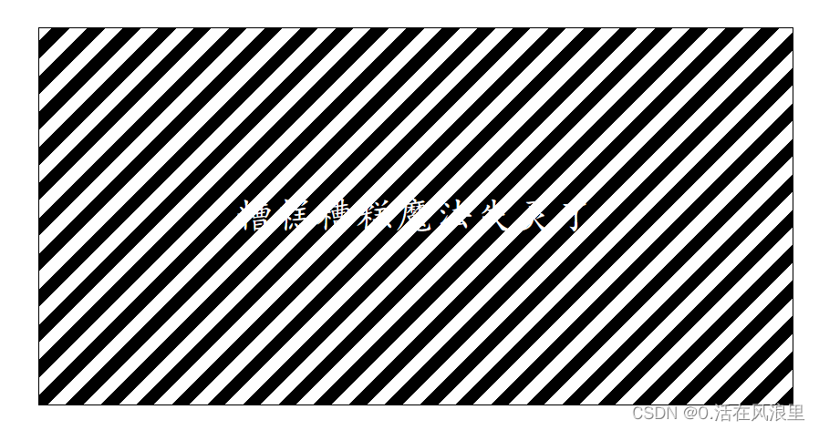
/* 0-10=黑 10-20=白 重复 */background-image: repeating-linear-gradient(-45deg, #000, #000 10px, #fff 10px, #fff 20px);
background-image: repeating-linear-gradient(to right, rgba(0, 0, 255, 0.096) 50%, rgba(0, 128, 0, 0.378) 60%), repeating-linear-gradient(red 40%, pink 60%);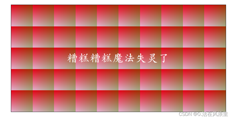
径向渐变(由其中心定义)
径向渐变就是沿着圆周或者椭圆周向外扩散的渐变。有一种水波扩散的感觉。
我们通过 radial-gradient();来定义一个径向的渐变。
background-image: radial-gradient(shape size at position, start-color, ..., last-color);shape 为椭圆形,size 为最远角,position 为中心。
shape 参数定义形状。它可接受 circle 或 ellipse 值。默认值为 ellipse(椭圆)。
size 参数定义渐变的大小。它可接受四个值:
closest-side :从中心点向外扩展渐变,到离中心点最近的一边结束。
farthest-side :以离渐变中心点最远的那一边计算圆的半径
closest-corner :以离渐变中心点最近的元素顶角计算渐变的范围。
farthest-corner :以离渐变中心点最远的顶角计算圆的半径。
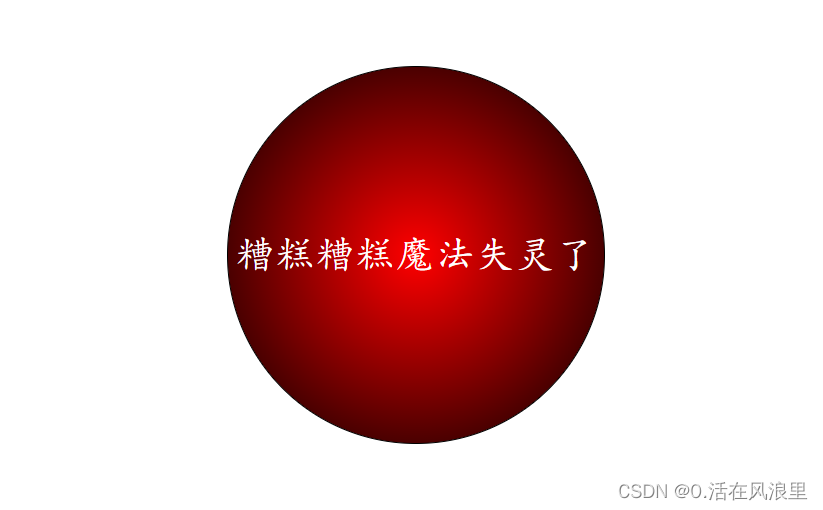
默认(椭圆 内向外)
background-image: radial-gradient(red, #000);
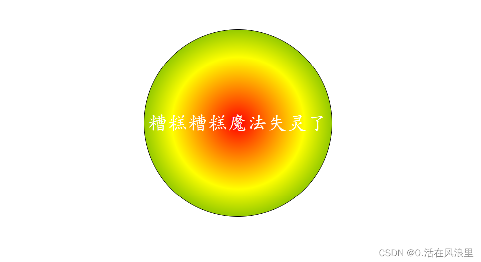
圆形
background-image: radial-gradient(circle, red , yellow , green);
设置径向渐变的中心点
用关键字 at 后面加上 position 属性支持的定位关键字和数值,指定渐变中心的位置。
background-image: radial-gradient(farthest-corner at 60% 55%, red, yellow, black);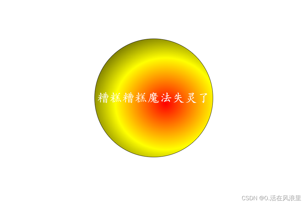
多背景图片
/* 多个背景图css背景色会失效,在最后一个背景图url后 是否平铺前 加颜色就好#ccc   位置后紧跟斜杠图片大小 */
/* 组合写用background :url() 是否平铺 水平 多少px  垂直 多少px/图片大小宽高,url() 背景色 是否平铺 水平方向 多少px 垂直方向/图片大小 宽高*/
background: url('https://img2.baidu.com/it/u=360501637,2066136816&fm=253&fmt=auto&app=120&f=JPEG?w=640&h=423') no-repeat left 15px center/150px 150px, url('https://img0.baidu.com/it/u=2515019553,1565721177&fm=253&fmt=auto&app=138&f=JPEG?w=500&h=443')#ccc no-repeat right 15px center/150px 150px;

结语:
祝大家bug一个接一个。。。。的消灭掉